Twentieth Century typography | tracking industry & society
Twentieth Century typography Tracking shifts in culture, industry & society
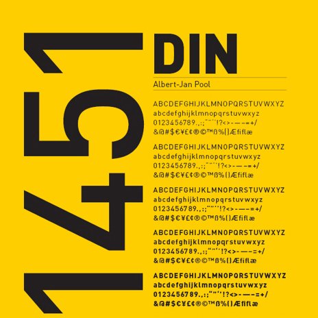
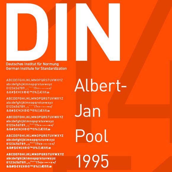
DIN was developed at the beginning of the twentieth century by the Prusssian railway for freight trains, which has a parallel with Frank Pick commissioning Edward Johnston to design a new typeface for the Metropolitan Railway, now the London tube: typography used to help make sense of extraordinary shifts in culture, industry and society, and typefaces that remain relevant and in use today.
Do we give equal consideration to the humble font today? Douglas Murphy writes about the contrast between the visionary everyman design of this period and Boris Johnson’s corporate/commercial pursuits, and Jonathan Glancey looks at contemporary transport systems and questions if we are sufficiently brave in the service of communication.