Light lessons for emotional impact | Borrowed from artists
Light lessons
Borrowed from artists, skirting the rules
At school yesterday we talked about light and graded colour and the fact that artists use stock building materials, fluorescent lamps and acrylic paint to disrupt space for physical and emotional impact. More scope for designers to use the same methods, perhaps, rather than following the rules.
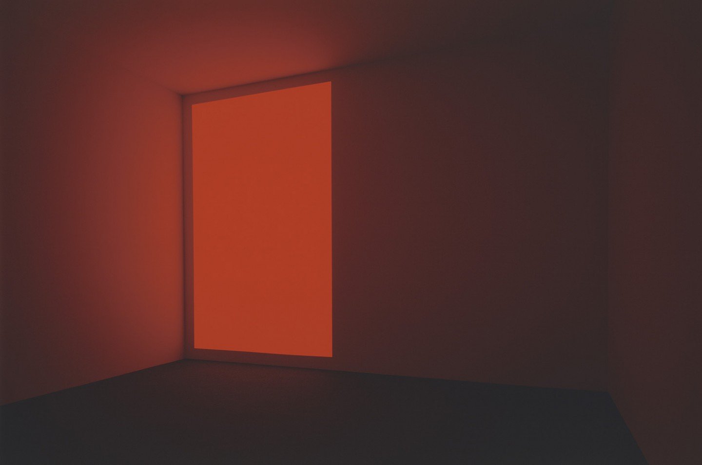
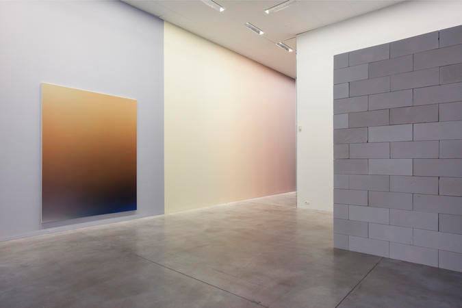
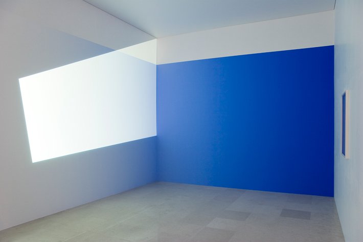
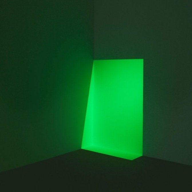
Pieter Vermeersch makes colour-graduated wall paintings for gallery installations and interior spaces, blurring the line between art, illusion and architecture, you could say James Turrell does the same but with light. Both use relatively simple materials, and understand the pleasure in saturated planes.
Kit Cuttle writes on this subject; he’s not keen on the tyranny of regulation and calculation which leaves the typical commercial space with bland, even light levels throughout. How much more enjoyable to have light and shade, modulation, focus and punctuation in our interiors, as we find in the natural world, particularly when technology no longer requires a brightly lit work surface.
Pieter Vermeersch Museum Leuven
James Turrell Pace Gallery
Kit Cuttle Lighting Design Objectives Procedure
The Interior Design School Professional Diploma